
Genre
To start with creation of my production company as well as music magazine i started by doing research into genre so that i had a better understanding of the different types of genre and how people respond to different types of genre
.
What is a magazine?
A publication of the most recent articles and photographs, these can be published every week or month, it's a thin papered book similar to a newspaper although more durable.
What is Genre?
Every different type of genre is governed by a set of codes and conventions, or rules that are followed for that genre.
Genre - Is a specific type of music, film or writing.
Genre is relevant to magazines as it can give the magazine a targeted style, audience and purpose, by following the conventions set out by particulars types of genre the magazine become a representation of that genre, a media text that reflects the style and demand set by that genre. Different audiences mass or niche that respond to various types of genre will respond to the magazine as it meets the expectations and requirements set by the audience and genre.
Rick Altman - Genre Theory
Rick Altman - Genre Theory
Research
When i was given the task the task to research into the history of my chosen genre, i was stuck i didn't know what genre i wanted to use, so i decided to keep an ope n mind and decided to reseach into both POP and R&B as i was indecisive between these two genres.
POP
Pop comes from an abbreviated form of the word 'popular'. The genre in its most modern form originated in the 1950's as it diverted from 'rock and roll'. The genre contains a plethora of various styles of music this can vary from; jazz to country, rock and roll to rap or be-bop to hip-hop., therefore is consistently changing depending on what is most recognizable and loved at the time, it can be easy to identify what songs are pop by their success on the pop charts. Pop music appeals to a mass audience hence why it’s called pop, it has to appeal to large quantity of varying people, so the guidelines and conventions don't have to be followed to the dot, as different people have different tastes and preferences. Over the past 50 years the most successful styles of music have been continuously changing, although there are still ways to identify pop.
R&B
R&B which means rhythm and blues, is made from a variety of different although related styles. It is often comprised of style like; jump blues, club blues, rock and roll, soul, funk, disco, and rap. Although since the turn of the 20th century R&B has had a large influence on popular music all over the world, it can be identified in forms of rock, country and jazz. Even though there many different styles, the music rhythm is clearly the most important and distinguishing part. All forms of R&B normally depend on a 4 beat and a back-beat, except rap which is something completely different.
Conventions
In music magazine covers there's a general convention followed by the publishers:
- You will find with most popular magazines the artist on the cover will overlap the actual title it, although this can vary depending on the artists popularity and global recognition, and with the less known magazines the name is bold and always viable as they want people to know, recognize and remember the company.
- The title will generally be bold, short and memorable. Most commonly a single word the pops up in your face, e.g. Vibe.
- There is always an artist on the front of the cover, this is because they sell the magazine, there face, gossip and music is what people want to see, the magazines are also promoting this artist to help them receive more global recognition.
- The colour scheme is also important, there is normally a small colour pallet used, generally two colours that contrast each other to stand out more, if there was a vast array of colours it becomes confusing as well as complicated to look at as your brain is trying to processes so many colours at once alongside and text and imagery. The colours are normally black and/or white or warm and cold colours, e.g. Orange and white.
- It's also common to find that many key words have been highlighted or in a different colour/font. This is because this is what the publisher wants you see first, it's what I like to call the fishing method, these words/artists are the bait that attracts you, followed by the short phases and stories promised within that's advertised on the front cover that reels you in to buy the magazine, lastly once you read it your 'hooked'.
- Lastly a variety of language techniques are used to make the magazine more memorable, cleaver puns and metaphors are used to attract the targeted audience into buying their product, e.g. "A hot girl spits fire".

Initial Ideas
I used magazines such as:
- Vibe
- We <3 POP
- Q
- Entertainment Weekly
- Clash
- Rolling Stones
This made it very clear that I need to change the theme, I wanted to use warmer colours such as pink and white yet I didn't want to follow the same scheme as many of my peers, it was clear I needed something more unique. So I decided to keep with the orange and play about with various shades of orange and red. My second problem was the name of my magazine, I didn't really scream pop therefore I decided to reinvent the name, creating 'The Beat'. I would then redesign all of my themes and backgrounds based upon this.
Angles
I was given the 'Jelly Baby' task, which requires me to research into various camera angles, still and moving. To show my understanding of each camera angle i used my classmates as models so that i could demonstrate each angle.
Still Shots:
Close up – A close up is a shot that keeps the camera on the face at all times, used to show the significance of a characters reaction and/or facial expression.
 |
| Mid Shot |
 |
| Close Up |
Close up – A close up is a shot that keeps the camera on the face at all times, used to show the significance of a characters reaction and/or facial expression.
Mid Shot – Also known as the medium shot, this is the most common camera angle in the filming industry, it shows less than a long shot however it’s closer so detail in setting, props, characters etc. is more easily visible.
 |
| Long Shot |
 |
| Extreme Close Up |
Extreme Close Up – Like a close up however different, it magnifies to see past what the human eye can generally see.
Aerial Shot – An outside camera shot, taken from high up
Establishing Shot – Similar to an Aerial shot however it stats the name of the location.
 |
| Low Angle |
 |
| High Angle |
Low Angle – A shot often looking up at a character making them appear bigger than what they are, creates a sense of power for that character.
Eye Level – A neutral shot, the camera is positioned in a point of view, as if it was a human, creating the sense that you are there. It’s positioned at the characters head (about five or six feet).
High Angle – A shot often looking down at a character, giving of the feeling of isolation and creating a lower status for the character.
 |
| Two Shot |
 |
| Over Shoulder |
Birds Eye View – A shot from directly above the scene, making people look small and insufficient giving the audience a feeling of godlike empowerment.
Two Shot – A medium shot depicting two characters, used to show the links and contrasts between the characters.
Over Shoulder –The camera is positioned over the shoulder of the character, this is most commonly used in conversations, making audience feel as if they were there.
Moving Shots:
Pan – A shot where the camera continuously moves left or right.
Tilt – A shot where the camera continuously moves up or down.
Dolly Zoom – This is when the camera is far away and zoomed in, and transitions to being closer however whilst zooming out creating a broader background.
Hand Held Shots - A shot in which the camera operator holds the camera during motion to create a jerky, immediate feel.
Collage
Collage
Magazine Research
Lighting
I decided to research into lightning because i wanted to capture the most professional looking picture for my magazine and i discovered lighting is key as it is what can make an image look real or fake when in front of the back drop, lighting can also highlight specific elements or hide others.
Differences

Mastheads
Looking at these mastheads i noticed that most of them don't consist of more than two to three different colours. First i looked at Top of the Pops, the pink colour clearly indicates that the target audience was girls as pink is commonly associated with young girls, compared to something such as Billboard which contains a various colours in a a simple font, this suggests that the magazine is aimed at both genders at a more mature age most likely mid 20's. Kerrang is a more unique masthead as although there are simple colours of black and white, the font has been distorted, containing cracks all over, making it bolder and standing out more, you can suggest that it's aimed at men because of this as the cracks connote chaos which can be associated with men as they want to appear strong and powerful, capable of breaking things.

There is a rule when choosing colours in designing almost anything, you should really use more than three colours this is because it can make the logo appear cramped and over crowed making it more harder to look at than appealing, the less colours used the easier it is to remember the logo therefore making it more recognisable.

I recently then developed my mastheads further to blue from orange due to more feedback that i have gathered. It was pointed out me that my masthead appeared to be more pop or rap rather than R&B, R&B stands for rhythm and blues therefore i decided to change my primary colour to blue.

I wanted to make my masthead easily memorable so by using one colour and a simple font, just like the popular music magazine the 'Rolling Stones', the red colour and font is easily recognsable and remembered worldwide. I wanted to make my masthead relate to my target audience which is urban youth, the blue is a calming cold cold colour that conforms to the style of RnB, the style of music is calm and relaxing which is what i attempted to reflect in my logo.
Audience
When I started my research into what type of magazine genre i wanted to base my magazine on i thought it would be a good idea to also look into audiences, how they are affected by media, the various types of audience and how they are important to media in general, this is what i discovered:Your audience is the group of people your product appeals to, in media there are various types of audiences,
- An individual or collective group of people who read or consume any media text.
Without audiences there would be no media, this is because media organisations produce various media texts to make profit
No Audience = No Profit
The mass media is becoming increasingly more competitive with each passing year, to attempt to attract different audiences to gain more profit to therefore produce more media text.
There are two types of audiences:
- Mass Audience - Also known as 'Broadcast audience', this is audience that consume mainstream or popular media texts and content.
- Niche Audience - This is contrasted to mass audience as it would be a small select group of individuals that have very unique interests.
How media affects the audience:
The hypodermic needle modal -
- This theory suggests that media is like a needle, in the sense that it injects various ideas, attitudes and beliefs into the audience.
- E.g. Watching an act of violence causes you to want to do something violent, mostly occurring in younger minds.
- The audience would be seen as passive audience.
- This occurs in both Mass and Niche.
Audiences can be divided into set categories of social class.
Group A (Upper Class):
- Lawyers
- Doctors
- Scientists
- Well paid professionals
Group B (Social-economic):
- Teachers
- Middle management
- Fairly well paid professionals
Group C1:
- Junior management
- Bank clerks
- Nurses
- 'White collar' professionals
Group C2:
- Electricians
- Plumbers
- Carpenters
Group D:
- Drivers
- Post sorters
- Manual workers
Group E:
Note: Categories aren't fixed, you can move up or down (Based on income)!
Uses and Gratifications Theory:
- The audience decides what to do with the media rather than the media having an influence on the audience...
- When an audience actively seeks media, they want to gratify a need - the message of the media is not being forced on them, they chose to interpret the message it's conveying.
E.g.
- Identity
- Information
- Entertainment
- Social Interaction
Tribes
Tribes are everywhere in the modern world, they define the young generation. But what are tribes, well Channel 4 wanted to explore the mind of teenagers; to see their perspective on life and what's important to them, being their grades or even their social status. They discovered a plethora of patterns within their lives, grouping them into 25 tribes that split into 5 categories.
Theses are:
Alternatives
- Young Alts
- Skaters
- Hardcore
- Hardcore Gamers
- Superfans
Mainstream
- Chavers
- Fan Girls
- Chavs
- Sports Junkies
- Blingers
Leading Edge
- Activists
- Creatives
- Urban Artists
- DYIers
- Scenesters
Urban
- Get Paid Crew
- Stylers
- Trackies
- Wastemen
Aspirant
- Trendies
- Vloggers
- New Casuals
- Hypebeasts
- Hipsters
Who is my magazine aimed at?
My music magazine is going to be aimed at the urban section of the tribes, mostly aimed at the Stylers tribe, this tribe represents status and style, it's about partying, looking good and staying ahead of cool.
Stylers hold strong on the UK Tribes map – innately cool and stylish, the rising influence of Urban fashion and music have made them a hugely aspirationsal Tribe for youth today. As luxe sportswear and Urban high fashion has hit the Aspirants, more young people than ever before are looking like a Styler and aspiring to their luxury lifestyle.
What do they look like?
Stylers are young urban adults, that like to stay ahead of fashion and trends.


These people are always on the move and in a crowd socializing, in and out of jobs normally part time as they're still in some form of education. They eat a lot of take out food such as pizza as they're always busy; partying or studying. They are innately cool and stylish, the rising influence of Urban fashion and music have made them a hugely inspirational Tribe for youth today.
Music Magazine Timeline

Billboard:
 |
| Billboard Advertising |
The front cover was in black and white featuring a a photo of R.C Campbell, a advertising executive.
 |
| The Billboard |
At the start of 1961 'The Billboard' was changed to 'Billboard Music Week' as it became devoted to publishing content on the music industry. Before being changed to 'Billboard' in 1963.
 |
| Billboard Music Week |
 |
| Billboard (Modern) |
Billboard basically started out as a newspaper, due to the limitation in technology, relying on the text included on the front cover, however as time progressed it's become simpler, now using visual images to attract their target audience that display the content within the magazine.
Audience Research
Magazine Design Ideas
Front Cover

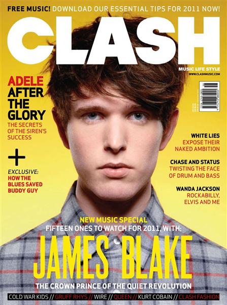
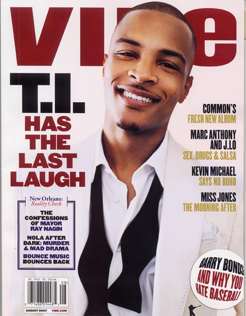
Here i have created my first Front cover ideas for my music magazine titled 'The Beat', using my previous research i have decided that i want to use R&B as my chosen genre for my magazine. Knowing this i used popular rap artist Tinie Tempah as my artist to represent my magazine. i also looked at other magazines such as Vibe and Q and used conventions from them that i have chosen to include in my first draft.

 Looking at these two other magazines and the common conventions between the two, I started with the artist and how they appear in front of the title of the magazine, so using layers in Photoshop; first i imported a picture of Tinie Tempah from the web onto an A4 sized document, i then proceeded to crop out the background so that i could place my own design behind him. I then imported my maths head into the document and positioned it to behind the artist. Another convention that i used as the advertisement of the artists name on the cover of the magazine, for example on Vibe you can clearly see 'Kanye West' and the same goes for 'Tinie Tempah' with Q, so again using layers on Photoshop in bold text i typed 'It's Tinie Tempah' so that it's clear and easy to see that he's the artist on the front cover of my magazine, which in turn would satisfy my target audience and therefore sell more magazines. The last convention that i used was the colour scheme, as you can see in Vibe the colour scheme is Blue and Pink, suggesting that it's trying to appeal to both boys and girls, you can see a similar colour set used in Q, however i wanted to use orange and white for my colour scheme as they are more gender neutral, therefore appealing to a mass audience.
Contents Page


 Here is the initial idea and first draft on my contents page, i looked at Vibes contents page as well as Rolling Stones and looking at the conventions of both of these magazines which incorporated into my contents page. I started by looking at the common conventions which is that both magazines have at least one picture on it, none of them are plan with only text, so again i used Tinie Tempah as my artist, however i followed vibes style more using only one image of the artist, my contents page is still very bland and needs many improvements as it's only a first draft giving me an idea to work towards for my final product. Secondly i looked at the use of background and i noticed in Vibes background is a giant V which represents the company, i liked this style and idea and i choose to use it in my own design by placing a B in the background of my contents page. However i didn't like the black and white colour scheme so i used conventions from the Rolling Stones contents page using white and warm colour (orange) to make the page stand out more and appear less boring towards my targeted audience.
Double Page Spread


Last is my double page spread, to create my initial ideas for this i looked at the conventions of double page spreads in other magazines such as Vibe and NME, the first convention of these magazines is that a double page spread always talks about an artist, weather it be about there personal life or career it's on there. So again using Tinie Tempah as my modal i imported a photo of him and uploaded it to a A3 sized document, i looked at how both magazines kept within their style of design on these pages and so did i, i used the same colour scheme as before without it interfering with the text by placing white boxes there. Another convention is that in the corner most magazines put the logo of their magazine so that if someone finds the magazine open hey can still see what magazine it is as well as showing that all information presented was researched by the company so that no one can copy the page and say that they created it. On the double page spread the image is often a heavily Photoshoped image to create a more bold and desired effect and look.
MRI Spring 2014
Base: Adults 18+ |
Audience (000)
|
% Comp
| |||
| Adults |
12,430
| ||||
| Men |
7,784
|
62.6%
| |||
| Women |
4,646
|
37.4%
| |||
| Age 18 to 24 |
3,326
|
26.8%
| |||
| Age 25 to 34 |
2,892
|
23.3%
| |||
| Age 35 to 44 |
2,466
|
19.8%
| |||
| Age 45 to 54 |
2,125
|
17.1%
| |||
| Age 55+ |
1,621
|
13.0%
| |||
| Age 18 to 34 |
6,218
|
50.0%
| |||
| Age 18 to 49 |
9,752
|
78.5%
| |||
| Age 25 to 49 |
6,426
|
51.7%
| |||
| Age 25 to 54 |
7,483
|
60.2%
| |||
| Age 21+ |
10,729
|
86.3%
| |||
| Median Age |
35.0
| ||||
| HHI $150,000+ |
1,577
|
12.7%
| |||
| HHI $100,000+ |
3,634
|
29.2%
| |||
| HHI $75,000+ |
5,318
|
42.8%
| |||
| HHI $60,000+ |
6,704
|
53.9%
| |||
| HHI $50,000+ |
7,583
|
61.0%
| |||
| Median HHI |
$65,294
| ||||
| IEI $100,000+ |
666
|
5.4%
| |||
| IEI $75,000+ |
1,383
|
11.1%
| |||
| IEI $60,000+ |
2,119
|
17.0%
| |||
| IEI $50,000+ |
2,892
|
23.3%
| |||
| Median IEI |
$33,616
| ||||
| Employed |
8,979
|
72.2%
| |||
| Professional/Managerial |
3,087
|
24.8%
| |||
| Any College |
7,679
|
61.8%
| |||
| Grad College+ |
3,243
|
26.1%
| |||
| Attending College |
1,893
|
15.2%
| |||
| Single |
6,207
|
49.9%
| |||
| Married |
4,382
|
35.3%
| |||
| Any Children in Household |
5,765
|
46.4%
| |||
| Own Home |
6,435
|
51.8%
| |||
| Median Value of Home |
$204,378
| ||||
| White |
8,929
|
71.8%
| |||
| Black |
2,072
|
16.7%
| |||
| Asian |
317•
|
2.6%
| |||
| Other |
1,351
|
10.9%
| |||
| Spanish/Hispanic Origin |
1,926
|
15.5%
| |||
| Metropolitan CBSA |
11,102
|
89.3%
| |||
| A/B County |
10,179
|
81.9%
| |||
| C/D County |
2,251
|
18.1%
| |||
| Readers-Per-Copy |
8.54
| ||||
| Circulation (000) |
1,433
| ||||
Institutions
What is an institution?
It's an organization founded for a religious, educational, professional, or social purpose.
IPC Media
It's one of the UK's leading magazine and digital publishers, with a large portfolio of selling 350 million copies a year. They group the magazines they publish into five groups:
Connect - Women's weekly magazines
Inspire - Leisure and specialists
Ignite! - Men's lifestyle and entertainment
South Bank - Women's lifestyle and home interests
TX - Portfolio of television titles
IPC media owns magazines such as NME (new musical express) and Gutiar and Bass.
Bauer Media Group
A large German publishing company founded in 1875 is a privately owned company under management of the Bauer family; operates in 15 countries around the globe. They own magazines such as Q, MOJO and KERRANG.
I think that IPC Media would publish my music magazine because it's a British magazine that would fit into their ignite category as it aims directly at young male adults, giving them various amounts of male musical entertainment, rather than BMG which operates on a more global scale, because my magazine would feature more local artists than hugely successful ones, therefore it wouldn't be as successful.
However i have chosen to create my own institution called the Beat Media Group, because i felt that although IPC Media is a local media institution I feel that given their publication history, my media product wouldn't publish my magazine where as Bauer Media Group would.
Key Conventions
The key conventions that i need to include in my front cover are:- Needs to have a short memorable title, that's large and obvious so that's clear to see it's the title of the magazine.
- The artists face must also be clearly visible, as they sell the magazine because people want to know more about their favorite artists.
- Price tag with bar code clearly displayed in the corner of the magazine.
- Various language techniques
- Name of the artist in bold, clearly visible
- Teaser content
The key conventions that i need to include in my contents page are:
- Page title at the top of the page ('Contents')
- Quotes form articles and artists, intrigues the reader making them go to that page.
- Features sections, stating what articles are in the magazine as well as numbered pages.
- Various images, taking up most of the page.
- Images from articles further within the magazine.
- Page number giving the location of each article.
- Large clear font, not letting the images disrupt the font for clear view.
- Possible advertisement.
The key conventions that i need to include in my double page spread are:
- Title or some form of logo at the top or top corner of the page.
- Name of the artists covered on the page, big clear font.
- Continuous color scheme (Has to be the same colour scheme as contents and front cover)
- Introduction to the artist and the article.
- Article about the artist, detailed, clear font at least a page worth of text and information.
- Contact details of the editor or production company.
- Highlighted sections or quotes to reveal their importance.
- Some text bold, highlighted, colouful font.
- Large picture of the artist surround by smaller images.
- Some text dragging between the two pages.
Flat Plans
Front Cover


Double Page Spread

Photo Ideas
Costume
Some of my initial inspiration:


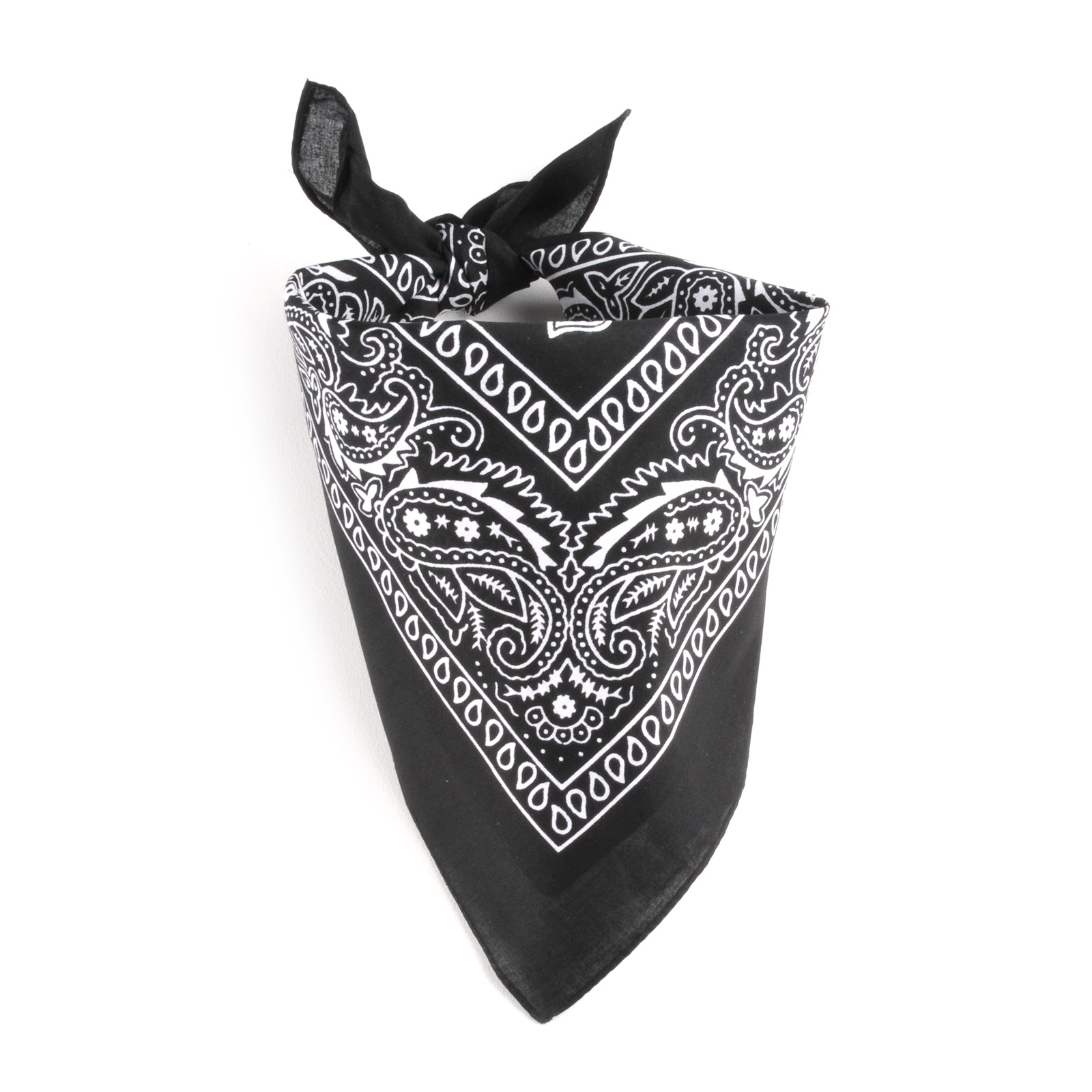
Before my photo-shoots i prepared a few costumes that i wanted my models to wear for the images, for example i asked my peer Tyler to originally wear a bandanna around his head along side a white shirt.
After hearing audience feedback i discovered that the bandanna actually took away the smart look at drifted away from my originally intention. In my re-shoot i had removed the bandanna to keep the white shirt.
I asked my other peer Eli to bring in a dress as well so that i could photograph her in the dress for my contents page.
Here are the costumes that i used:


Summary
No comments:
Post a Comment